Indianapolis’ 2nd Reformed Presbyterian Church is one of the longest-standing congregations in the RPCNA denomination. A Reformed Presbyterian Church is often laden with a stuffy, inflexible stereotype, and 2nd desired to create a brand that more accurately reflected their diverse, vibrant, active congregation.
Logo

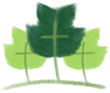
After discussing the church’s vision with the pastor, we felt that a tulip tree represented their growth, their ties to Indiana (it’s the state tree), and their wooded property.
We designed the leafs to be symbolic of the three crosses, mentioned in the Bible, and the Trinity. we chose a refreshing palette of greens and a strong Helvetica font to help reflect the modern direction the church was headed. Hand-drawing the leafs also gave the logo an organic feel that offset the industrial nature of Helvetica.

Website
To reflect the clean, modern airiness of the logo, we customized a WordPress template for 2RP. WordPress was chosen because they wanted to be able to manage their own content simply. You can explore their site at 2RP.church.


